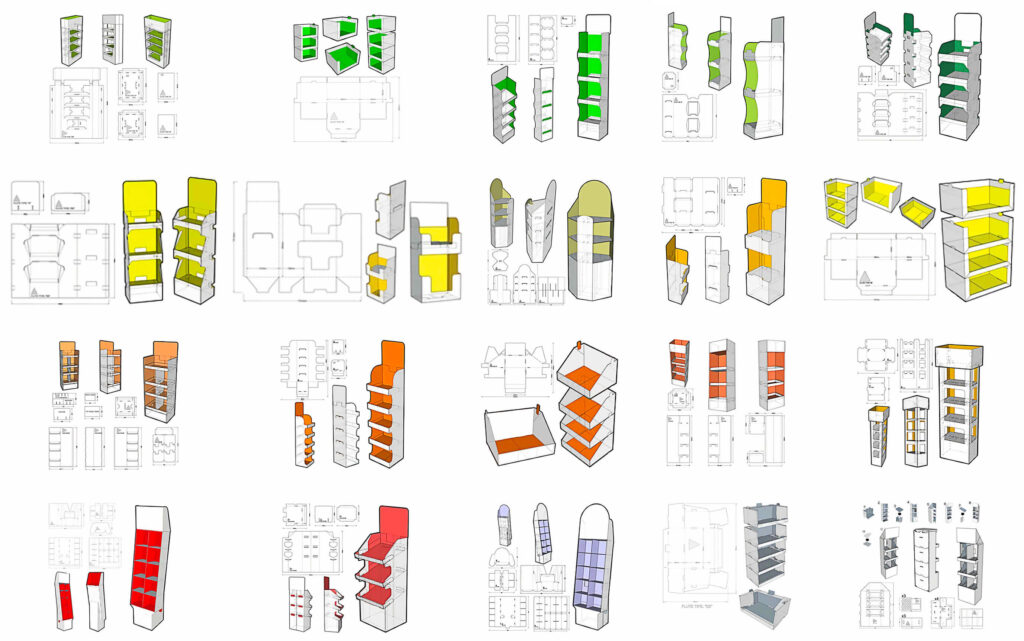
Color is one of the most powerful tools in marketing, and when it comes to cardboard displays, it can make all the difference in grabbing attention and driving sales. The right color scheme can evoke emotions, attract customers, and reinforce your brand identity. In this post, we’ll explore 5 color schemes that will make your cardboard displays stand out and become irresistible to shoppers.
1. Bold and Bright: Energize and Excite
When you want your display to pop and grab attention in a busy store, bold and bright colors are your best friend. Think vibrant reds, yellows, and oranges—colors that are known to stimulate energy and excitement. This color scheme is ideal for products that are designed to excite or for promotions that need to catch the eye quickly.
- Best For: Limited-time offers, seasonal promotions, impulse buys, or high-energy brands.
- Example: A bright orange display for a new snack or beverage line that’s all about fun and excitement.
- Why It Works: Bold colors evoke a sense of urgency and create an emotional response that encourages action. They make your display stand out in even the most crowded retail environments.
2. Minimalist and Monochrome: Elegant and Timeless
For brands that want to convey sophistication and luxury, a minimalist monochrome palette is the way to go. Think sleek black, white, and gray tones with clean lines and understated design. This color scheme works beautifully for high-end products like cosmetics, tech gadgets, or luxury goods.
- Best For: Luxury products, premium goods, fashion brands, or tech items.
- Example: A black-and-white display for a high-end perfume or watch brand that emphasizes simplicity and elegance.
- Why It Works: Monochrome color schemes give a sense of refinement and exclusivity, letting the product take center stage while reinforcing the brand’s premium quality.
3. Earthy Tones: Warmth and Sustainability
Earthy tones like deep browns, greens, and tans create a natural, organic feel. These colors are perfect for brands that emphasize sustainability or eco-friendliness. Whether you’re showcasing eco-friendly packaging, organic products, or anything related to nature, earthy tones give your display a grounded, welcoming vibe.
- Best For: Eco-friendly brands, natural beauty products, organic foods, or outdoor gear.
- Example: A cardboard display with shades of green, brown, and beige promoting sustainable home goods.
- Why It Works: Earthy tones evoke feelings of warmth, comfort, and trust. They align with consumers’ growing desire for sustainable products and help position your brand as environmentally conscious.
4. Pastels: Soft and Inviting
Soft pastel colors like light pink, lavender, mint green, and baby blue create a calm and inviting atmosphere. This color scheme is perfect for products related to beauty, children, or wellness. It’s soothing and subtle, which can help customers feel relaxed and engaged with the display.
- Best For: Beauty products, baby items, health and wellness brands, or gifts.
- Example: A pastel-colored display for skincare products, creating a soothing and luxurious atmosphere.
- Why It Works: Pastel colors have a gentle, calming effect that makes them perfect for products that promote relaxation, beauty, or care. They evoke a sense of nurturing, making them ideal for products that focus on self-care or family.
5. Contrasting Colors: Eye-Catching and Dynamic
If you really want your display to stand out, use a high-contrast color scheme that combines opposites on the color wheel. Think blue and orange, red and green, or yellow and purple. These contrasting colors not only grab attention but also create a dynamic, visually stimulating experience for the shopper.
- Best For: Bold product launches, energy drinks, tech gadgets, or any product that wants to stand out and make a statement.
- Example: A red-and-green display for a holiday-themed product, or blue and yellow for an energy drink that needs to stand out on crowded shelves.
- Why It Works: High-contrast color schemes naturally draw the eye and create a sense of movement. They are visually striking, making it hard for customers to miss your display.
Conclusion: The Right Colors for the Right Message
Choosing the right color scheme for your cardboard display is about more than just aesthetics—it’s about sending the right message and evoking the emotions that drive customer behavior. Whether you want to energize, soothe, or impress, the right color palette can help you achieve your goals and make your product irresistible.
Remember to align your color choices with your brand identity and the emotions you want to evoke in your customers. A well-designed display with a thoughtful color scheme can be the key to standing out in a competitive retail environment.
Ready to design your own irresistible cardboard display? Let us help you pick the perfect colors to make your brand shine!


